Visualizing the Code-Document Table
Sankey Diagram
Data Visualization is a great way to simplify the complexity of understanding relationships among data. The Sankey Diagram is one such powerful technique to visualize the association of data elements. Originally, Sankey diagrams were named after Irish Captain Matthew Henry Phineas Riall Sankey, who used this type of diagram in 1898 in a classic figure showing the energy efficiency of a steam engine. Today, Sankey diagrams are used for presenting data flows and data connections across various disciplines.
-
Sankey diagrams allow you to show complex processes visually, with a focus on a single aspect or resource that you want to highlight.
-
They offer the added benefit of supporting multiple viewing levels. Viewers can get a high level view, see specific details, or generate interactive views.
-
Sankey diagrams make dominant factors stand out, and they help you to see the relative magnitudes and/or areas with the largest contributions.
In ATLAS.ti, the Sankey diagram complements the Code Co-occurrence Table. As soon as you create a table, a Sankey diagram visualizing the data will be shown below the table.
Further Reading
As soon as you create the Code-Document Table, a bar chart will be shown in the area below the table. To see a Sankey Diagram instead, click on the Sankey button in the toolbar.
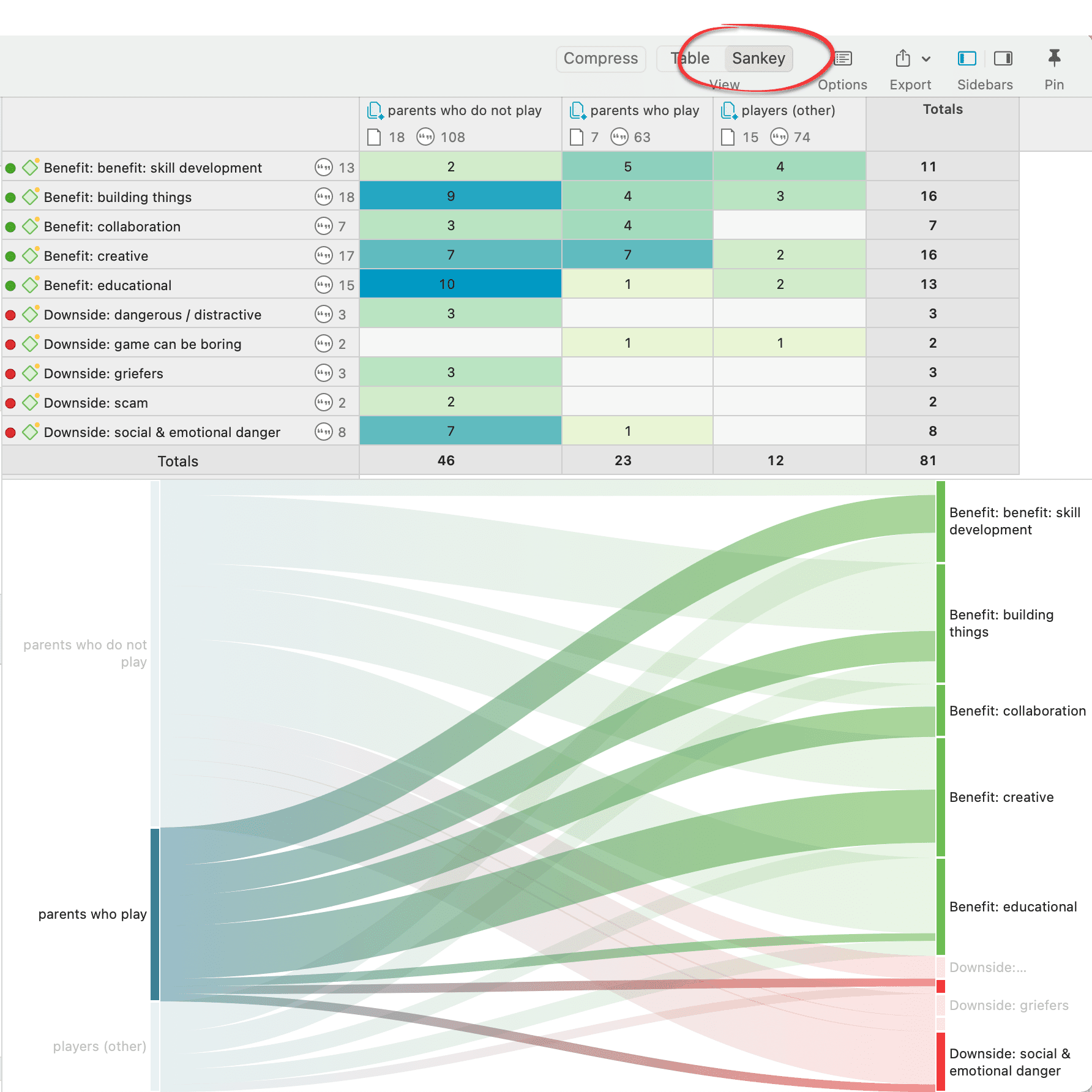 The row and column entities of the table are represented in the Sankey model as nodes and edges, showing the strength of co-occurrence between the pairs of nodes. In the Code-Document Table, the connecting pairs can consist of:
- codes - documents
- codes - document groups
- code groups - documents
- code groups - document groups
Edge: For each table cell containing a value, an edge is displayed between the diagram nodes. The thickness of the edges resemble the cell values of the table. Cells with value 0 are not displayed in the Sankey view.
The key to reading and interpreting Sankey Diagrams is to remember that the width is proportional to the quantity represented.
Layout
The Sankey diagram, similar to the network editor, applies a layout for its nodes and consequently to the edges connecting nodes to create an easy to comprehend visualization of the data. This basic layout places the selected entities (nodes in Sankey terminology) into vertical „layers“ with the row entities placed to the left and the column entities to the right. If nodes have incoming as well as outgoing links in the currently visible set of nodes, they will be placed in intermediate lanes or layers.
Interactivity
-
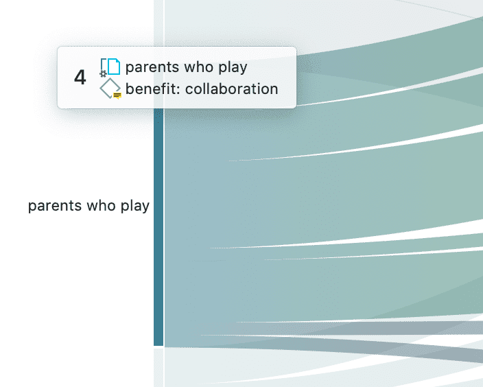
To display the quotations that are responsible for the co-occurrence of two entities, click on the connecting edge. This has the same effect as clicking a table cell. You see the quotations displayed in the Quotation Reader to the right.
-
If you hover an edge with your mouse, the numbers that you also see in the table cells are shown. Be default, these are the number of codings in the selected document or document group.
-
To support finding the correct link, moving the mouse highlights the hovered edges. After selecting an edge, the unselected edges are dimmed to further increase the visibility of the edge under consideration.
-
Selecting a node will highlight this node as well as all its incoming and outgoing edges. This makes it easy to spot areas of connectivity.
Removing edges
To remove a node from the diagram, right-click and select Remove from View.
In addition to the Remove from View options, a number of other options are available from the context menu, like for instance to change the code color.
The same may be accomplished by modifying the selection lists, but this is a bit „heavier“, and it may not be clear which entities need to be deselected.
Bar Chart
As soon as you create a Code-Document Table, a bar chart will be shown in the area below the table.
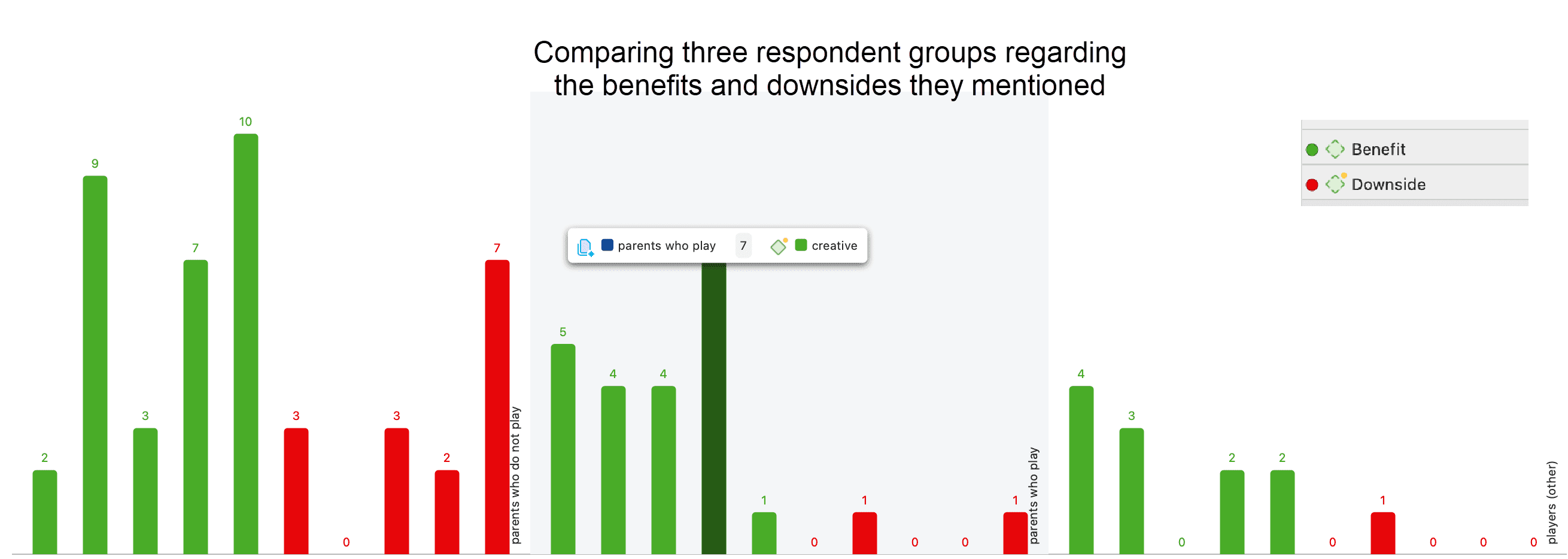 If you hoover over a bar, the code (code group) - document (document group) pair will be shown.
For the visualization as bar chart, it is often preferable to change the code colors. You may also want to switch around the rows and the columns. You find this option in the ribbon of the Code-Document Table.
.
The table below shows the same comparison as above, only this time each subcode was given a different color. The subcodes for benefits range from green to blue; the subcodes for downside are red to yellow.
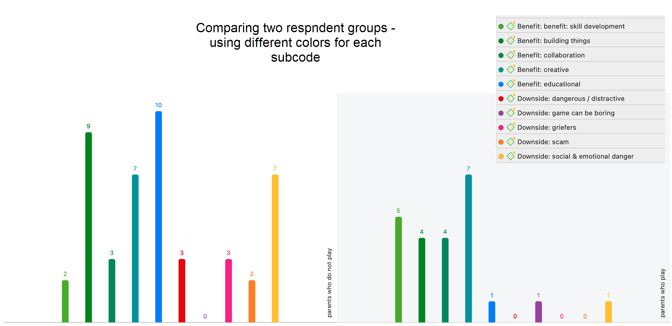
There is currently no legend. The one you see in the images are copy & pasted screenshots. Also, the code colours have to be changed manually. For a more convenient work with the graphics there will be further options in future updates.
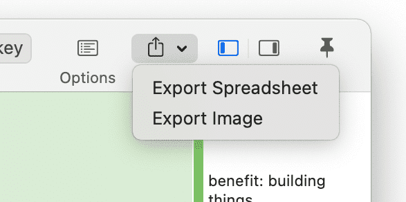
Export as Image
To save the Sankey diagram as image, click on the Export icon in the upper right-hand corner and select the option Export Image. The Sankey diagram will be saved in png format.